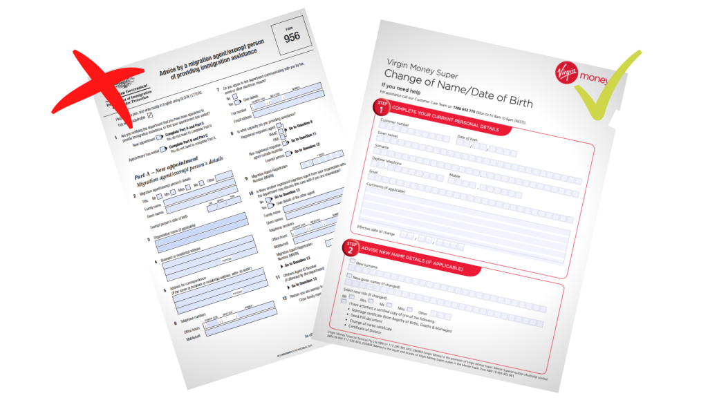
Your Forms Impact Your Business
Many businesses rely on effective forms to collect data from their customers, yet individuals can be hesitant to fill them out.
Making the experience as easy and quick as possible will go a long way to getting the information you need and building respect with your customers. Any document you provide for your customers influences their behaviour and how they view your organisation.
Even small design decisions can have a powerful impact on form completion speed, completion rate and accuracy of customer information. So here are some tips on how to make your forms user-friendly.
What Should You Do?
Make your forms user-friendly by:
- Only including content that is relevant and appropriate to your customers.
- Keeping them short and clear with simple English
- Using an intuitive structure with effective labels that helps customers navigate them quickly
- Making the writing easy to read using a column structure that eliminates confusion
Read on to explore these tips in more detail.

Research
The Simplification Centre at the University of Reading performed a study to find out what people notice about information they receive from businesses.
For a month, a group of volunteers were asked to keep a diary of their thoughts on every document they received unsolicited through the mail (rather than online). The quotes use below are taken from this study.
1. Include Relevant and Appropriate Content
Know your audience well and make sure your documents are appropriate for them.
“Form doesn’t have all the options you need.” (Postal banking form).
“Not returning as rather limited questions and not allowing more open response. The questions were biased, not allowing you to say what you think, and no comments box.” (Service feedback request form).
In the Simplification Centre’s study, participants were grateful for organisations that had used information they already had to part-complete a form on their behalf.
Participants also noted inconsistencies in content and irritations regarding the language used.
“A typical case of non-thinking. All other supplementary pages ask for the taxpayer reference at the top. This one asks at the bottom.” (Tax form).
“The ‘simply do x’ language is irritating – what if I don’t find doing it simple? Then you are saying I’m stupid!” (Railcard application and form).
2. Keep it Clear and Concise
Make your forms user-friendly by keeping them short and simple. Use simple and plain English avoiding jargon and technical language.
“Guidance notes quite hard work and key actions in using the form could have been highlighted. Language not user friendly. No encouragement to use form!”
“Probably not all [ ]’s fault – the law is very complex. But even simple things to do with carried forward losses are either missing or ambiguous, needing a call to the help line (who weren’t sure either!).” (Tax form).
Collect only necessary data. Eliminating unnecessary questions and the amount of writing/typing required reduces user effort and increases completion rates.
Explain the purpose of the form upfront and tell your customers exactly what is expected from them, and why, with no room for ambiguity.
“Quite good instructions making it clear which sections have to be completed.” (NS&I savings reinvestment form).
“General concern with the lack of information regarding the implications of doing (or not doing) something.” (Tax form foreign pages).
“It doesn’t tell you whether you should calculate to the nearest (or lowest) pound or penny. Given that all the other forms have to be filled to the pound, and I think this is meant to be to the penny, this raises a problem.” (Tax form).
3. Use an Intuitive Structure
A form is like a conversation, so should reflect logical communication between yourself and your customer.
Help users navigate your form quickly and easily by using a logical structure and grouping related fields together.
Ensure labels and headings are clear, with an obvious hierarchy. If your form is hard to scan, it takes longer for users to complete it.
“The priorities of the paragraph titles are unclear – is black a higher or lower level of grouping than green? It appears to be higher but a larger type face would have been clearer.” (Tax form)
4. Ensure Usability and Legibility
Make your forms user-friendly by ensuring the content is easy to read. It is recommended you keep your font to 2mm x-height as a minimum (11 or 12 point for most typefaces).
“Print far too small, unnecessarily so on Page 2 where there’s plenty of room for a larger font.” (Shares form of acceptance).
When it comes to form layout, eye tracking and A/B studies have shown that single column forms increase comprehension and completion speed.
Help Your Business by Helping Your Customers
Taking the time to make customer experiences quicker and easier will greatly support their positive experience with your business.
Whether your form is physical or online, considering the above factors when creating it will help your customers build trust and respect for your organisation.
And ultimately, it will help them to provide the information you need to succeed.
Want to Learn More?
Check out these articles:
Employee engagement in change management
Knowledge Management 10 point checklist


